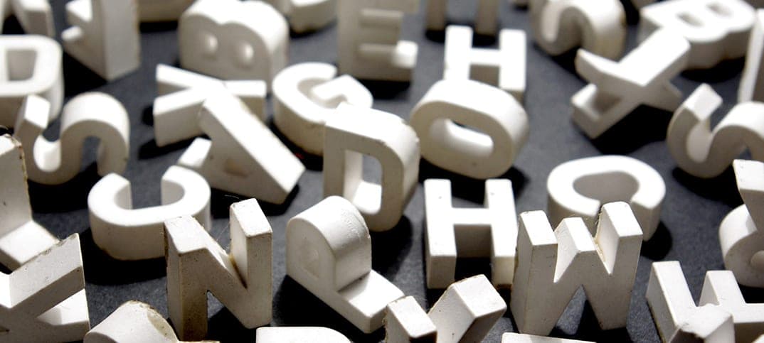
Why Fonts Matter in Website Development: The Role of Typography
Typography often goes unnoticed until it’s done poorly—but the moment you land on a website with cramped text or overly stylized letters, you understand the vital importance of great fonts. Within the realm of website development, selecting good web fonts or awesome lettering fonts isn’t just a cosmetic choice; it profoundly influences readability, user experience, and overall brand identity. Whether you’re using digital fonts to convey professionalism or opting for playful visuals, the role of typography can’t be overlooked.
Enhancing Readability and User Experience
In an age where visitors skim rather than read entire paragraphs, easy to read fonts make it simpler for users to digest information. If a text layout is convoluted or employs a typeface that’s too small, complex, or light, potential customers may exit the site before fully understanding your offerings. That’s where selecting the font easiest to read comes into play. It ensures your content remains accessible to a wide audience, preventing high bounce rates and fostering better engagement.
Why Readability Is Critical
- Instant Impressions: Within seconds of arrival, users judge your site’s professionalism. Legible typography presents a polished first impression.
- Effortless Scanning: Clear headings and subheadings guide readers to vital details, making your site’s layout more intuitive.
- Reduced Eye Strain: Using fonts for electronics that are specifically designed for on-screen viewing reduces user fatigue and helps maintain focus.
Building Brand Identity Through Typography
Typography acts as a silent ambassador for your brand. Whether you’re aiming for a bold, modern vibe or a classic, authoritative tone, the fonts you choose convey your personality. Good fonts for websites align seamlessly with the brand’s color palette, imagery, and message, creating a memorable aesthetic. In contrast, mismatched typefaces can distract from the content’s value, even if your products or services are top-notch.
Aesthetics and Emotional Connection
- Typeface Personality: Serif fonts can suggest tradition or elegance, while sans-serifs often project a modern edge.
- Unique Elements: Incorporating awesome lettering fonts in headers or logos can add a distinctive flair.
- Consistency: Reusing the same typefaces across digital touchpoints—like social media graphics or newsletters—reinforces brand recognition.
Boosting Engagement and SEO
Search engines reward websites that keep visitors engaged. By implementing the best fonts web approach—where design complements legibility—you inherently encourage longer session durations. When users read content thoroughly and navigate deeper into your site, it sends positive signals to search engines, potentially impacting your rankings. Meanwhile, using electronic font selections optimized for fast loading can also improve page speed, another known ranking factor.
Technical Optimizations
- Loading Efficiency: Hosting or caching your digital fonts properly avoids performance bottlenecks.
- Mobile Responsiveness: Ensure your typeface remains crisp on smaller screens. If your site looks great on a 27-inch monitor but becomes illegible on a smartphone, you could lose a huge segment of potential customers.
- Minimal Layout Shift: Fewer typeface changes can mean fewer layout shifts, contributing to a smoother user experience.
Key Considerations When Choosing Fonts
- Legibility First: Even the coolest or trendiest typeface won’t help if it’s not the easiest font to read in paragraphs and longer texts.
- Personality Matching: Pick typefaces that reinforce the emotional tone of your brand—professional, playful, or sophisticated.
- Pairing Rules: When combining multiple fonts, ensure they complement rather than clash. Often, this means pairing a neutral body text font with a more expressive headline font.
- Size Matters: Body text typically performs best around 16px to 18px or higher, reducing eye strain and boosting readability.
- Testing Across Devices: Since visitors use phones, tablets, and desktops, confirm that your chosen typeface scales gracefully in each scenario.
The Future of Typography in Website Development
As browsers evolve and fonts for electronics become more sophisticated, designers have more freedom to experiment. From variable fonts that adapt weight and style without multiple files, to subtle animations triggered on scroll, typography is no longer static or bland. Yet, the fundamental rule stands: clarity and consistency outrank novelty alone. Even the most awesome lettering fonts can backfire if they overwhelm the user experience.
Conclusion
In short, typography is far from an afterthought in website development. It shapes how users interact with content, the emotional resonance of your brand, and even your site’s SEO performance. By zeroing in on good web fonts, aiming for easy to read fonts, and potentially adding a dash of flair with awesome lettering fonts, you establish both practicality and personality on every digital page.
Whether you’re rebranding an existing site or building a fresh platform from the ground up, investing in great fonts can yield direct benefits—higher engagement, stronger brand recall, and improved search engine visibility. So as you fine-tune your color schemes and layouts, remember to elevate your typography. It might just be the subtle difference that turns casual visitors into loyal subscribers and paying customers.
For a complete guide on website development and choosing great fonts, check out Great Fonts for Website Development: Best Web Fonts, Good Fonts for Websites & Awesome Lettering Fonts. This guide covers the best fonts web developers can use, ensuring readability, performance, and style.