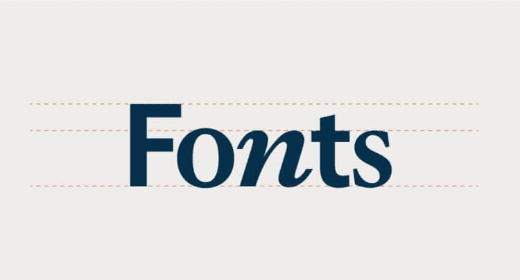
Choosing the best web fonts can do wonders for your online presence. In the realm of website development, typography sets the tone for how visitors experience your brand, read your content, and navigate your pages. While aesthetics certainly matter, great fonts must also be easy to read, load efficiently, and work seamlessly across devices. Below, we look at some top picks for modern web design, plus tips on how to get the most out of them-backed by industry research and best practices from high-authority sources.
If you're starting from a screenshot, mockup, or brand asset, run it through our Google Font finder from image to identify the base Google Font typeface before choosing performance-friendly alternatives.
Why Typography Matters for Modern Websites
A well-chosen typeface doesn't just serve as a design flourish. It heavily influences site usability, speed, and even conversions. According to a study from the Nielsen Norman Group-a highly respected UX research firm-readers overwhelmingly prefer easy to read fonts that minimize cognitive strain. Good typography in website development translates to higher content absorption, reduced bounce rates, and improved user satisfaction.
Moreover, the Google Web Fundamentals resource notes that optimally loading good web fonts can positively affect site speed, a ranking factor in Google's algorithm. This is crucial for digital marketing and user retention, making font selection more than just a stylistic choice.
1. Roboto
- Why It's Great: Created by Google, Roboto is ubiquitous across Android devices and countless websites. Its geometric shapes with open curves maintain clarity at any size.
- Best For: Tech startups, blogs, or e-commerce sites looking for a contemporary, minimal feel.
- Performance Note: Roboto is widely cached, so visitors may already have it on their device-leading to faster load times.
2. Open Sans
- Why It's Great: With a neutral yet friendly design, Open Sans remains one of the most frequently used fonts on the internet. Google's analytics show that it's among the top in Google Fonts' usage statistics.
- Best For: Corporate websites, educational platforms, and any content-heavy project needing easy to read fonts in large paragraphs.
- Performance Note: Minimal stroke contrast helps it render crisply across diverse screen sizes, from tiny mobiles to large desktops.
3. Montserrat
- Why It's Great: Inspired by urban signage, Montserrat embraces modern curves with a bold, eye-catching flair. It's ideal for striking headlines or brand statements.
- Best For: Creative agencies, fashion retailers, or lifestyle blogs that crave a contemporary, distinctive look.
- Performance Note: While Montserrat offers multiple weights, loading too many can slow the page. Consider limiting yourself to 2-3 weights for optimal speed.
4. Lato
- Why It's Great: Lato features semi-rounded letters that infuse warmth and friendliness into otherwise strict sans-serif layouts.
- Best For: Humanitarian NGOs, community-based websites, or startups emphasizing accessibility and approachability.
- Performance Note: Because it's a lighter font family (in terms of file size), sites that rely on electronic font usage for various languages can integrate Lato without heavily impacting speed.
5. Merriweather
- Why It's Great: As a serif font designed explicitly for screen reading, Merriweather pairs well with more minimalist sans-serifs. It balances traditional elegance with modern legibility-perfect for longer reads.
- Best For: News portals, editorial platforms, and knowledge-base wikis.
- Performance Note: Using a single style for body text and a sans-serif for headings helps manage the total file count.
Balancing Aesthetics with Performance
Fast Loading Times
High-authority sources like Mozilla Developer Network emphasize that each font weight (e.g., Light, Regular, Bold) adds extra load time, especially on slower connections. Serving only essential weights keeps your site nimble.
Minimizing CLS (Cumulative Layout Shift)
To avoid the dreaded "font flash" or layout shifts, you can leverage font-display: swap in your CSS. This ensures text appears in a fallback font until your digital fonts load completely, offering an immediate reading experience with minimal jarring transitions.
Considering Accessibility
Whether you pick a flamboyant heading style or awesome lettering fonts for visual branding, maintaining a contrasting, easily scannable body text remains paramount. The W3C Web Accessibility Initiative suggests at least a 4.5:1 contrast ratio between text and background. Even the font easiest to read won't help if placed against a poorly chosen color scheme.
Utilizing Decorative or Lettering Fonts Wisely
Decorative fonts can bring personality to your site, but they should be used sparingly. A stylized script might suit headings or call-to-action banners, but body copy demands easy to read fonts. Large blocks of stylized text can frustrate readers and lead to higher bounce rates-a direct blow to your SEO and engagement metrics. If you want good fonts for websites that highlight your brand's creative edge, consider limiting them to logos, section titles, or special highlights.
How to Implement These Fonts for Electronics
- Link or Self-Host: Connect to a reputable CDN like Google Fonts, or self-host for more control (and possibly faster local performance).
- Subset for Efficiency: If your site is in English only, omit extra character sets to shrink file sizes.
- Preconnect and Preload: If you use advanced performance techniques (e.g.,
<link rel="preconnect" href="https://fonts.gstatic.com">), you can fetch font resources quicker. - Test on Multiple Devices: Because visitors could be on smartphones, tablets, or desktops, confirm your type choices display smoothly in each scenario.
Final Thoughts
Selecting the best fonts web approach is equal parts creativity, technical optimization, and user empathy. Whether you're seeking the easiest font to read for blog paragraphs or awesome lettering fonts to define your brand identity, your ultimate goal is to harmonize clarity, speed, and aesthetic appeal. Keep in mind that "simple yet impactful" usually wins the day. Although the internet offers thousands of potential typefaces, focusing on a handful of trusted options-such as Roboto, Open Sans, Montserrat, Lato, and Merriweather-can streamline decision-making and yield a polished, professional feel.
By thoughtfully curating your fonts for electronics usage and following best practices from authoritative resources, you can elevate your site above the noise. Ultimately, well-chosen good web fonts resonate with visitors, guide them through your content, and boost overall engagement in your website development journey. So, embrace typography as a powerful ally-one that influences first impressions, fosters trust, and even nudges conversions in the right direction.
For a complete guide on website development and choosing great fonts, check out Great Fonts for Website Development: Best Web Fonts, Good Fonts for Websites & Awesome Lettering Fonts. This guide covers the best fonts web developers can use, ensuring readability, performance, and style.


