Next Edge: The Secret to Blazing-Fast Mobile & Desktop Next.js Apps
1. Introduction
Speed matters more than ever in modern web development. As online competition increases and user patience decreases, delivering a fast, responsive, and tailored experience for both mobile and desktop visitors is critical. Big tech companies like Facebook have mastered this by serving mobile-specific versions of their sites-often denoted by an "m." prefix or a /m/ directory-ensuring the best layout, images, and scripts for users on phones or tablets.
Next Edge takes these best practices and makes them accessible in a Next.js environment. With a combination of static site generation (SSG) and edge middleware, you can dynamically serve mobile or desktop pages-without relying on slow server-side rendering (SSR). By the time a request reaches your site, you already know if it's mobile or desktop, and the page is served from the nearest edge node for lightning-fast performance.
2. Why Mobile & Desktop Need Different Versions
It's no secret that mobile and desktop devices differ in screen size, resolution, bandwidth, and user interaction patterns. What looks stunning on a 27-inch monitor might become cramped or inconvenient on a 5-inch phone screen. A separate layout, optimized images, and lighter scripts for mobile can drastically improve your load times and overall user experience.
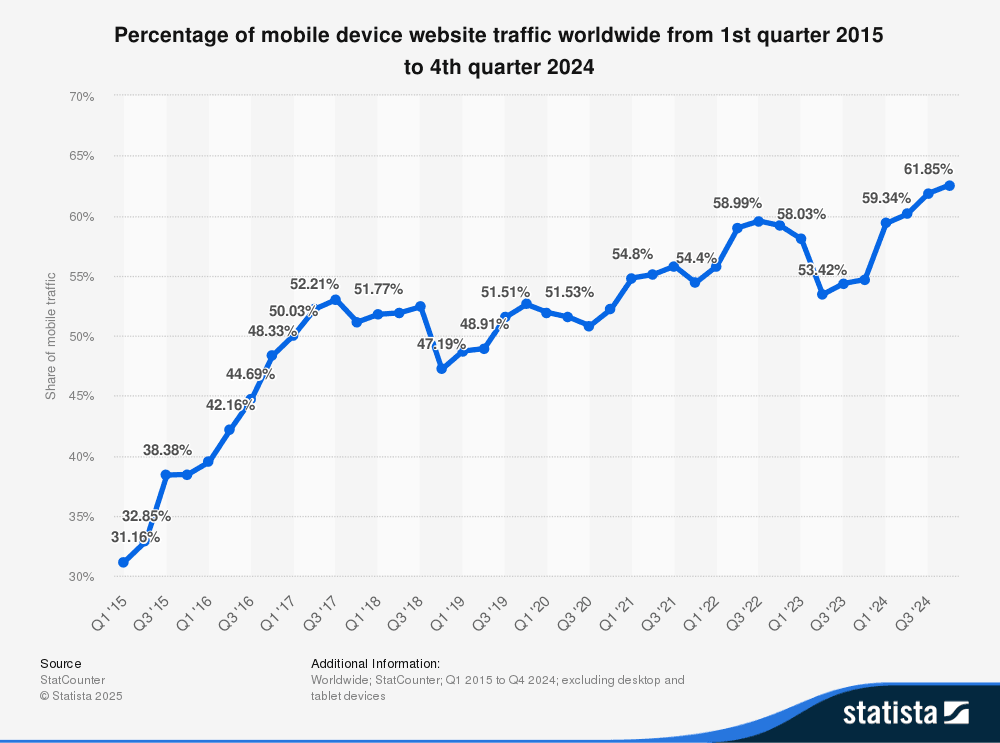
Given these statistics, it's clear that a one-size-fits-all approach to front-end design can result in high bounce rates. Splitting your site into mobile and desktop versions solves this problem-each user gets the most suitable design for their device.
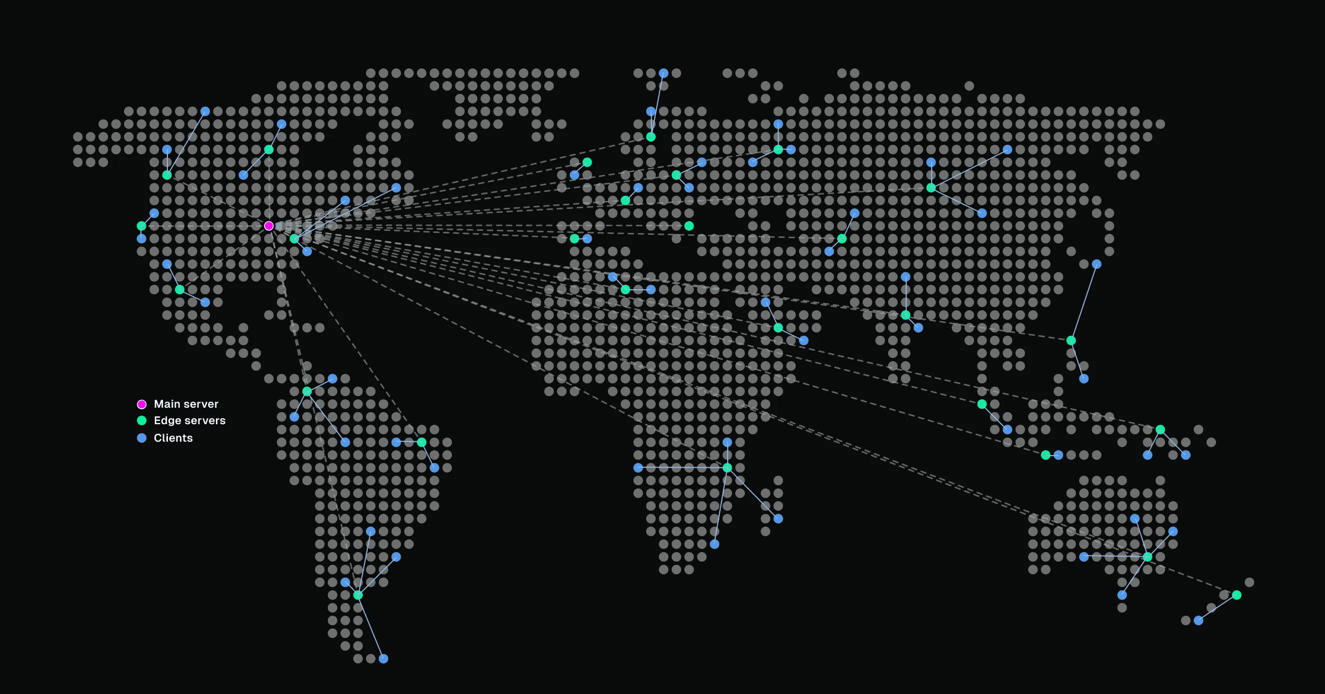
3. The Edge Advantage: Serving Static Content Fast
Before edge computing gained popularity, websites typically ran on centralized servers or a small number of data centers. If a user was physically distant from those servers, the site felt slow due to network latency. Edge computing bypasses that hurdle by distributing content across geographically dispersed servers, serving up pages from the node closest to the user.
-server
-edge
Reduced Latency, Faster Pages
- Latency Reduction with Edge Computing: Research comparing centralized cloud servers and edge servers found that hosting logic and content closer to the user significantly lowers response times.
- Static Site Generators and Improved Performance: According to Cloudflare, pre-rendering pages (as opposed to generating them on demand) slashes load times because no server-side processing is needed at request time.
When you combine static builds with edge delivery, pages load almost instantly, providing a user experience on par with the biggest tech companies.
4. How Big Tech Does It: /m/ and m. Subdomains
Have you ever noticed how Facebook adds /m/ to the URL-or sometimes uses an "m." prefix-when you visit from a mobile browser? This approach isn't just branding; it's a technological decision to serve a lighter layout, smaller images, and more mobile-friendly scripts.
- /m/ approach: The site is laid out in a separate directory, where pages are designed specifically for small screens.
- m. subdomain: A subdomain like
m.facebook.comis dedicated to mobile devices, helping the site's back-end logic quickly determine which resources to load.
This strategy ensures that desktop users get the full, feature-rich experience, while mobile users receive a version of the site that's tailored to their devices' constraints.
5. Building Your Next.js App for Mobile & Desktop
In Next.js, you can replicate this concept by creating two sets of pages-one for desktop, one for mobile-both statically generated at build time. Here's an overview:
Create a /m/ directory in your app folder.
- For every page, you have a desktop version in
/and a mobile version in/m/.
The mobile pages can reference smaller images, simplified layouts, and fewer scripts for optimal performance.
Static Build for Each Version
- Run your usual build process (e.g.,
npm run build), and Next.js will generate static HTML files for both sets of pages-desktop and mobile-resulting in two sets of fully static files. - There's no SSR overhead, keeping everything lean and fast.
By investing a bit more development time to maintain two sets of pages, you get total control over user experience on each device type. Rather than forcing one layout to handle every scenario, you're free to fine-tune each version with minimal compromises.
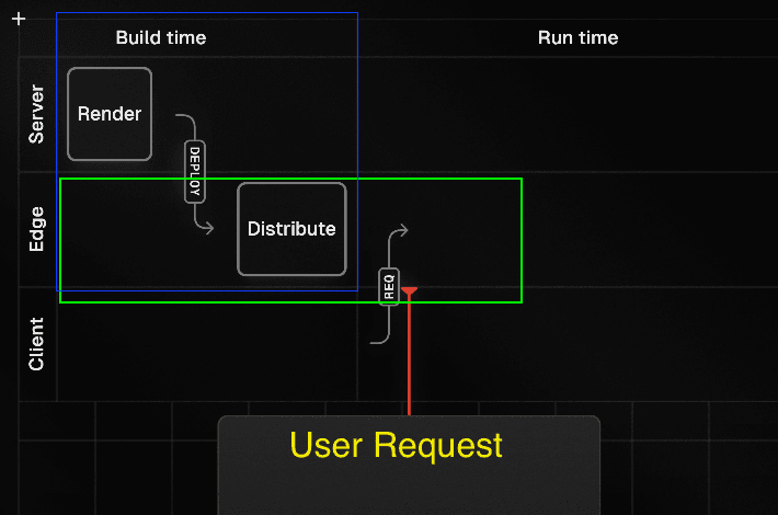
6. Putting It All Together at the Edge
Now that you have two sets of static pages, how do you choose which one to serve on the fly? This is where Next.js edge middleware comes in. When a request hits your site, the middleware detects the User-Agent (whether it's likely mobile or desktop) and then rewrites the path to serve the appropriate static assets.
No code snippet is shown here, but conceptually:
- You intercept the request at the edge with middleware.
- You parse the
User-Agentheader to determine device type. - You redirect or rewrite the request to either the
/m/(mobile) or the standard directory (desktop). - Users instantly receive a static, optimized page from the nearest edge node.
The result? Ultra-fast load times, device-specific designs, and the ability to mimic how industry leaders like Facebook manage their mobile vs. desktop traffic.
7. Performance Comparison: Edge vs. Centralized Cloud Servers
Latency Reduction with Edge Computing
A study titled "Latency Comparison of Cloud Datacenters and Edge Servers" reveals that distributing content to edge nodes closer to the user achieves significantly lower latency, enhancing real-time applications and interactive web experiences.
Static Site Generators = Improved Performance
According to Cloudflare, using a static site generator means pages are built ahead of time, virtually eliminating server-side processing at request time. This leads to faster Time to First Byte (TTFB) and smoother overall performance.
By combining both strategies-static generation and edge delivery-you maximize speed for all your visitors, no matter their location or device.
8. Conclusion
Meeting modern performance expectations requires both optimized device experiences and strategic content delivery. By building separate mobile and desktop pages and serving them via edge middleware, you deliver fully static, lightning-fast content that feels personalized and robust.
Big tech companies have demonstrated how effective it is to direct mobile traffic to a dedicated layout-whether it's "m." or a /m/ directory-and now you can bring that same level of sophistication to your Next.js apps. If you've ever wondered why you see "m." on Facebook or other major platforms, it's because they've mastered the art of delivering the right experience to the right device without sacrificing load speed.